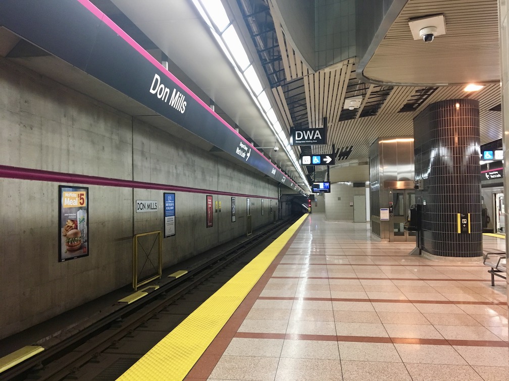
Don Mills station is the end of Line 4 and is very pink. It doesn’t show up well in photographs, but when you get off the train, it’s like looking through rose-coloured glasses: the accents are more pink than purple, and the backgrounds are more Burgundy than beige, which leads to a whole pink feeling. It’s weird, unexpected, and I kind of like it. However, besides that, Don Mills isn’t great.
The station is lonely. Like all of Line 4, it feels vastly over-designed for crowds that will probably never come. However, unlike the new TYSSE stations, which feel designed for the future, this one just feels sad.
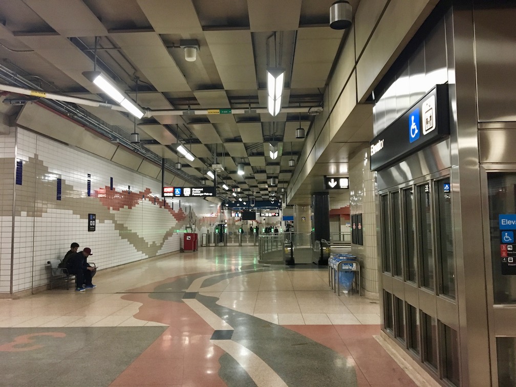
Don Mills has a visually busy theme that does not match the actual business of the station.
Sheppard signage sucks. It’s far too complicated, and has much too much text on it. There is no concept of information hierarchy, so important instructions like where the buses are or where the subway is is buried alongside pictograms for escalators and stairs. Really, the only part that stands out are the EXITs, and even those suffer from overly long and
weirdly-
broken textual
descriptions.1
Let’s see some examples:
Starting from the subway platform, quick! Can you find the buses?
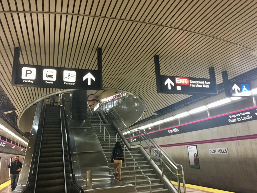
The Buses are buried in with Parking and Escalator (one of which is useless because I can see it’s an escalator). Also, all of these signs lead to the same place, so why are they separate? Unlike Highway 407, the stairs and escalator are functionally equivalent, so their signs should not be separated.
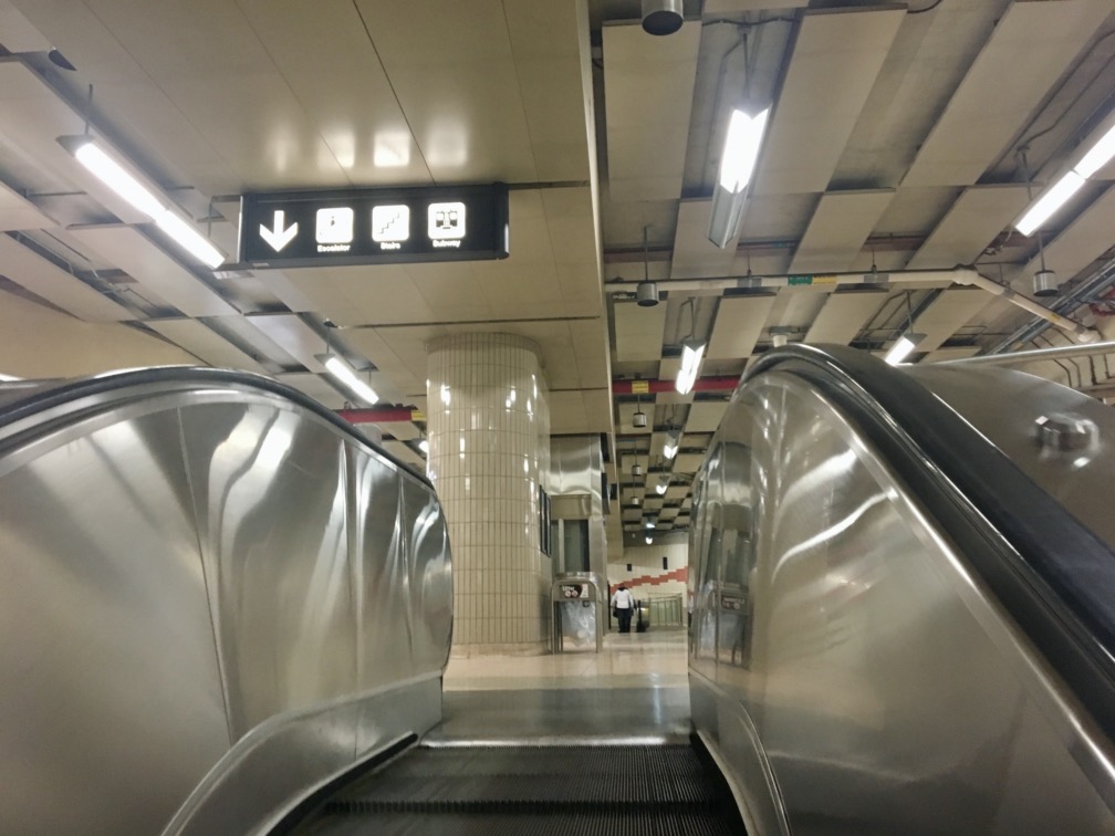
Coming to the top of the stairs, I see — wait! Isn’t that where I came from? This sign is actually for the people behind me, but it makes it look like I’ll be heading back to where I came from. Also, why is there no purple stripe? Can’t (then) brand-new signs follow their own new standard? (Also note the redundant and blurry Escalator and Stairs obscuring the more-important Subway.)
EXIT sign, are “Sheppard” and “Avenue” different? Because the line break would seem to say so.2 Looking back at the mezzanine over the subway platform:
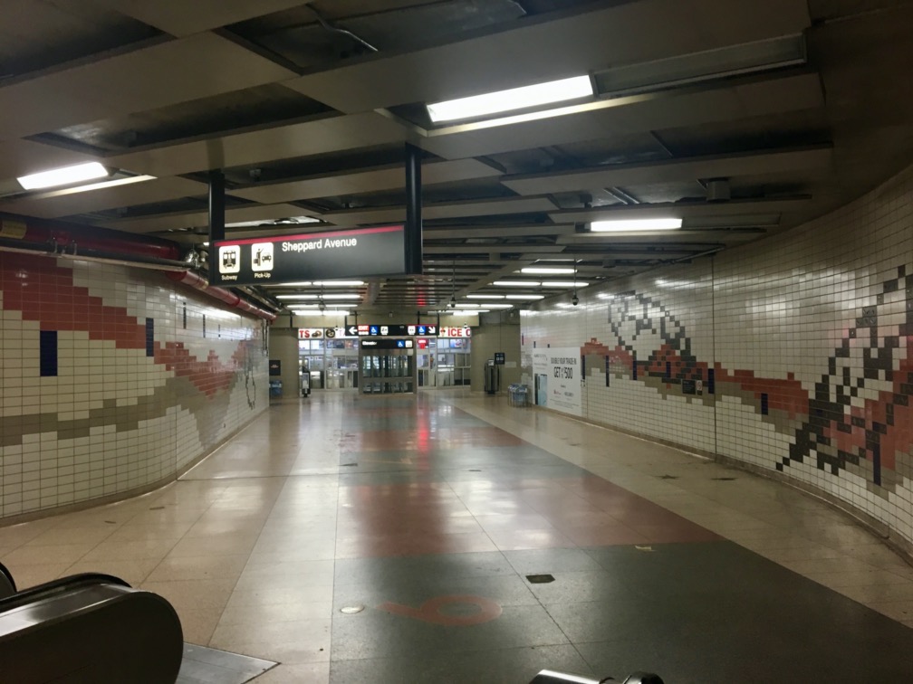
These signs are just inconsistent:
EXIT? No arrow? Why, unlike the previous sign, is “Passenger Pick-up” not spelled out?
Finally, in the bus terminal, these signs are just atrocious:
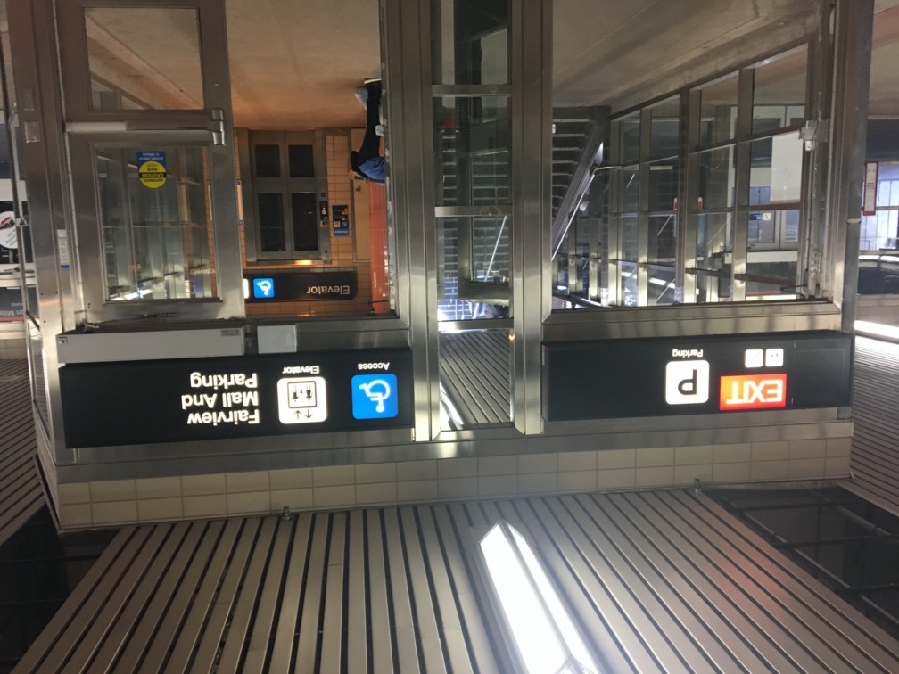
Elevator symbol separate from Access[ible]? Where is there an elevator that is not accessible?I think the TTC was convinced that if there was space for three lines, all three lines needed to be used, and I suppose they decided on this odd combination so that they would all be about the same length.
Fortunately, these signs are no longer the standard, and the new signs brought in with the TYSSE are much more – well – useful. I also like the new intermodal pictograms they’ve created with the operator’s logo and colour on top and the mode (such as bus or train) on the bottom, as can be seen at Union or Yorkdale stations. Unfortunately these were not around for the TYSSE, but I think they should be useful going forward.
Now we just have to excise these ^ from the rest of the system. It’s a pity that (excluding the newest 2014+ signs) the older a TTC sign is, the better it works.